
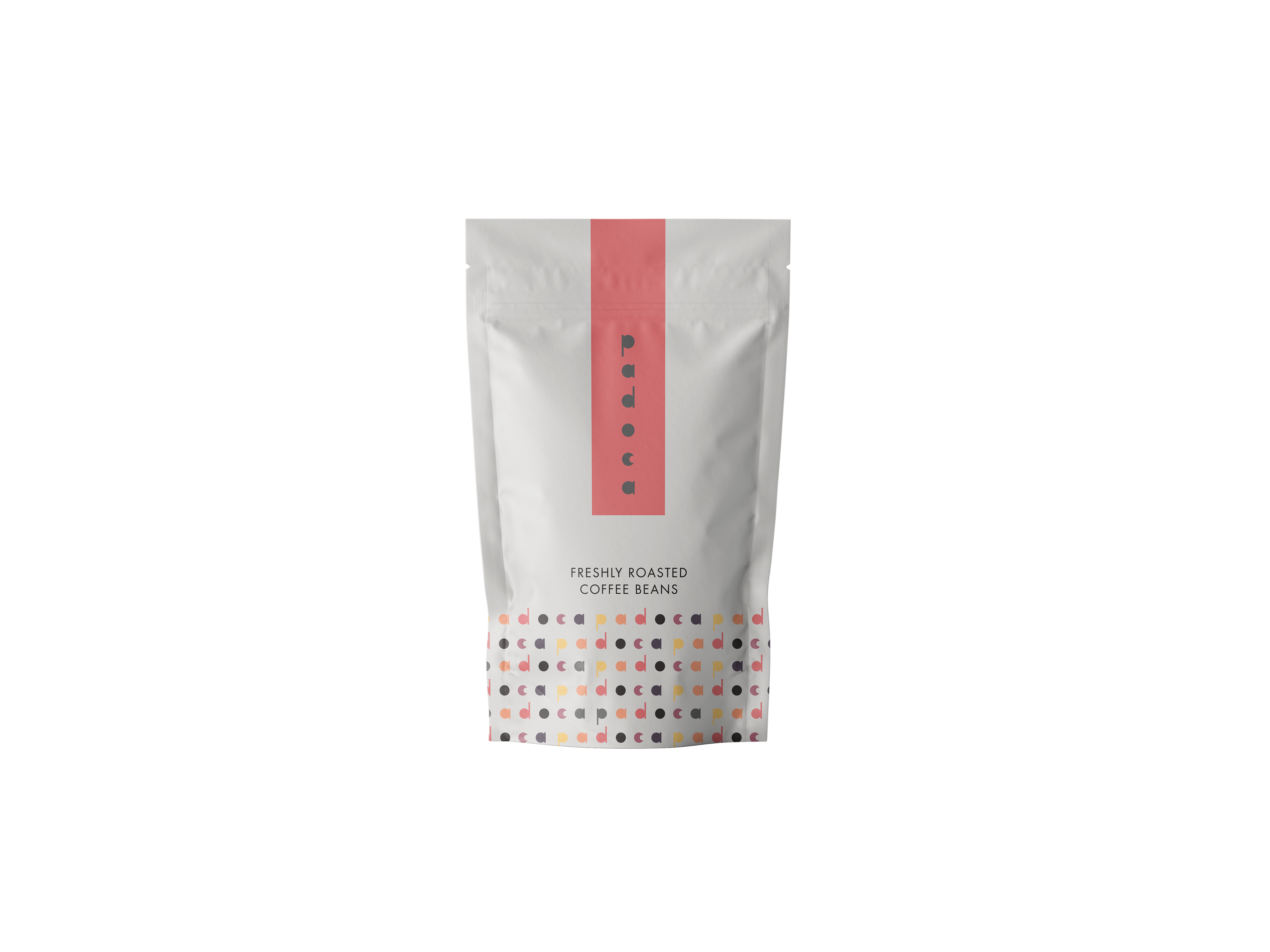
Coffe Package
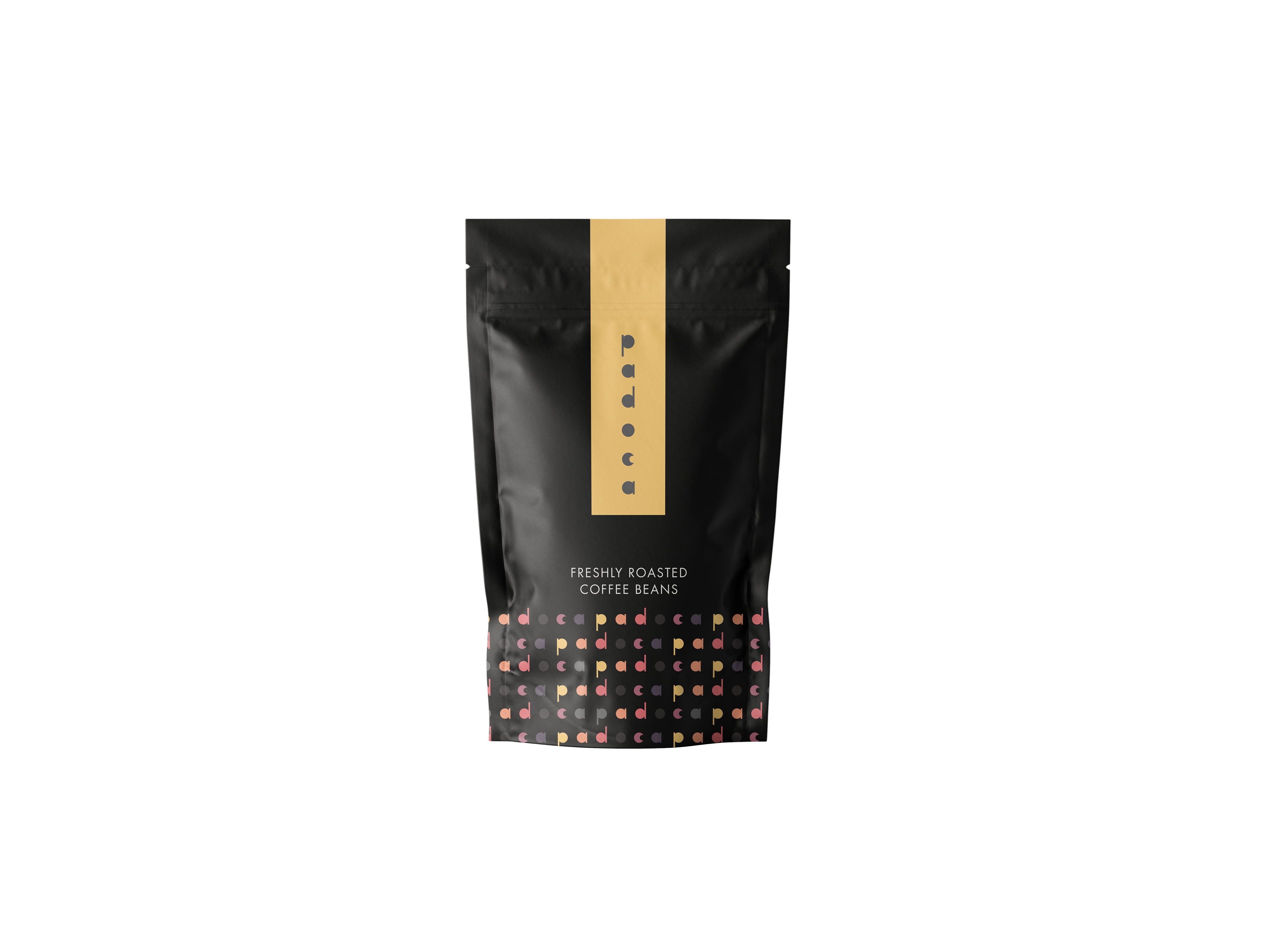
Coffe Package
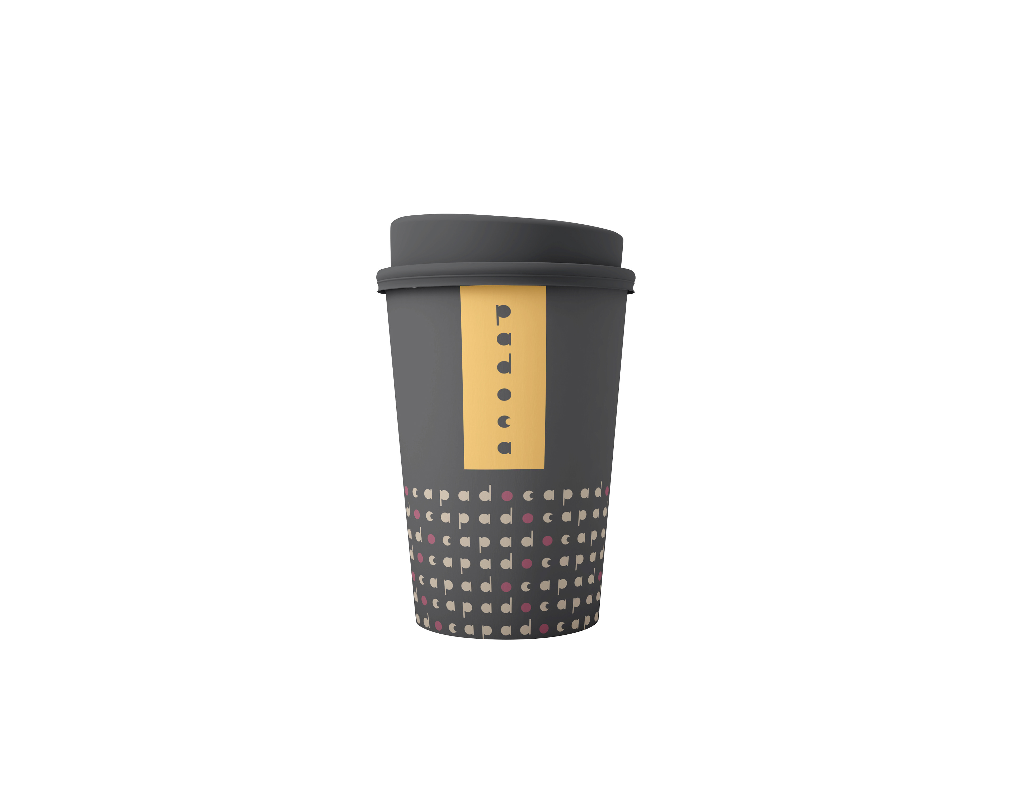
Paper Cup
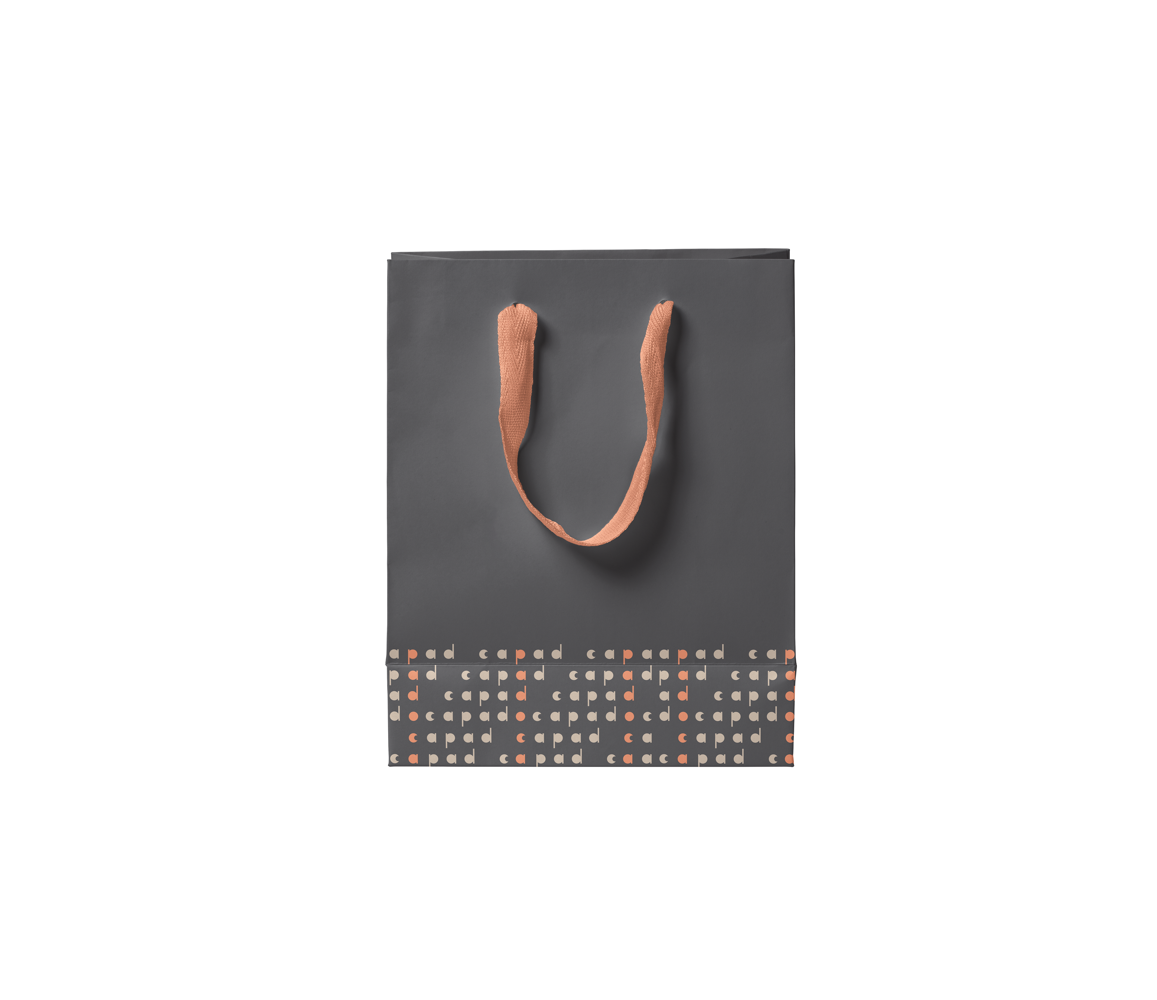
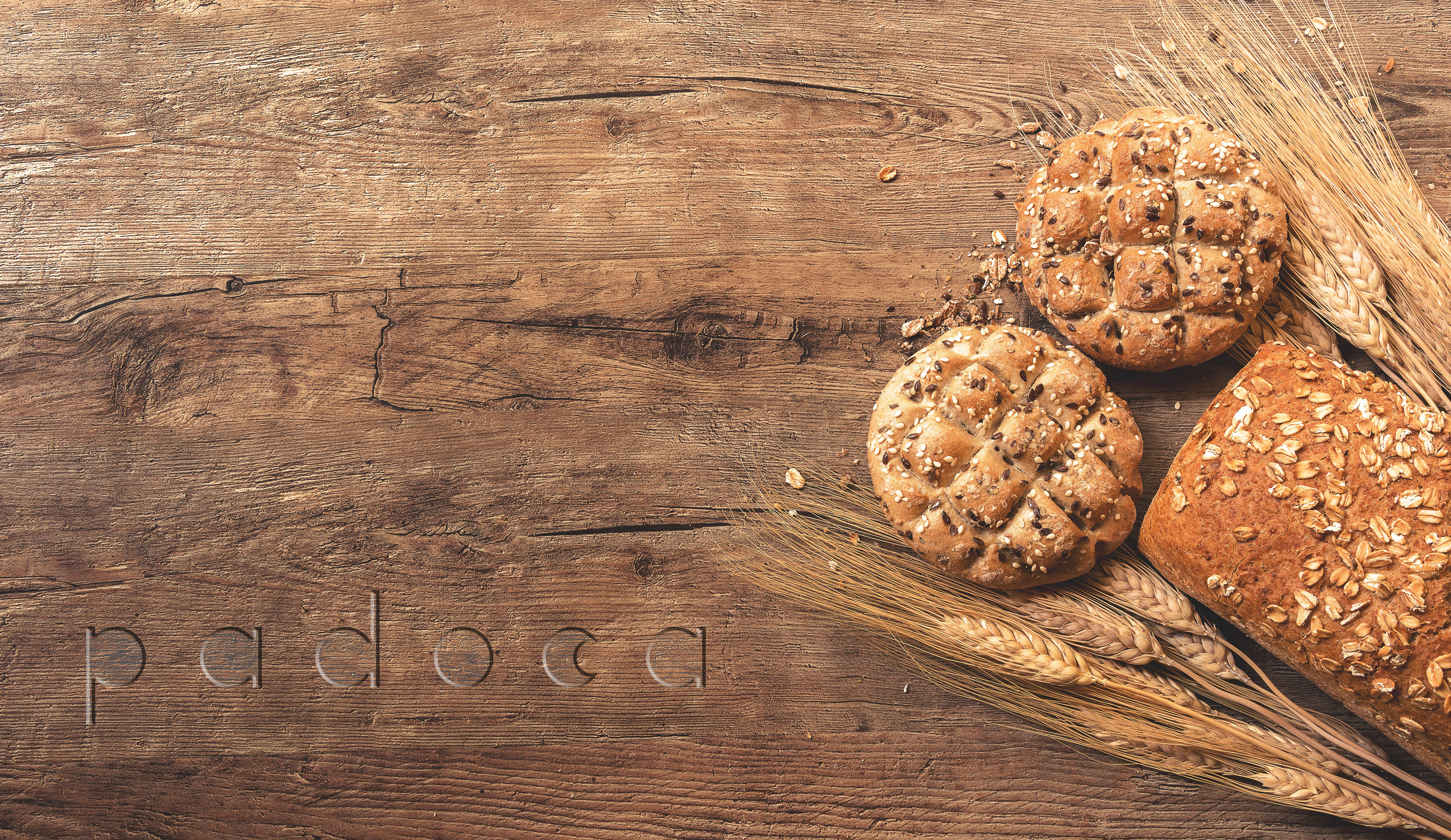
Paper Bag


Tri Fold Menu
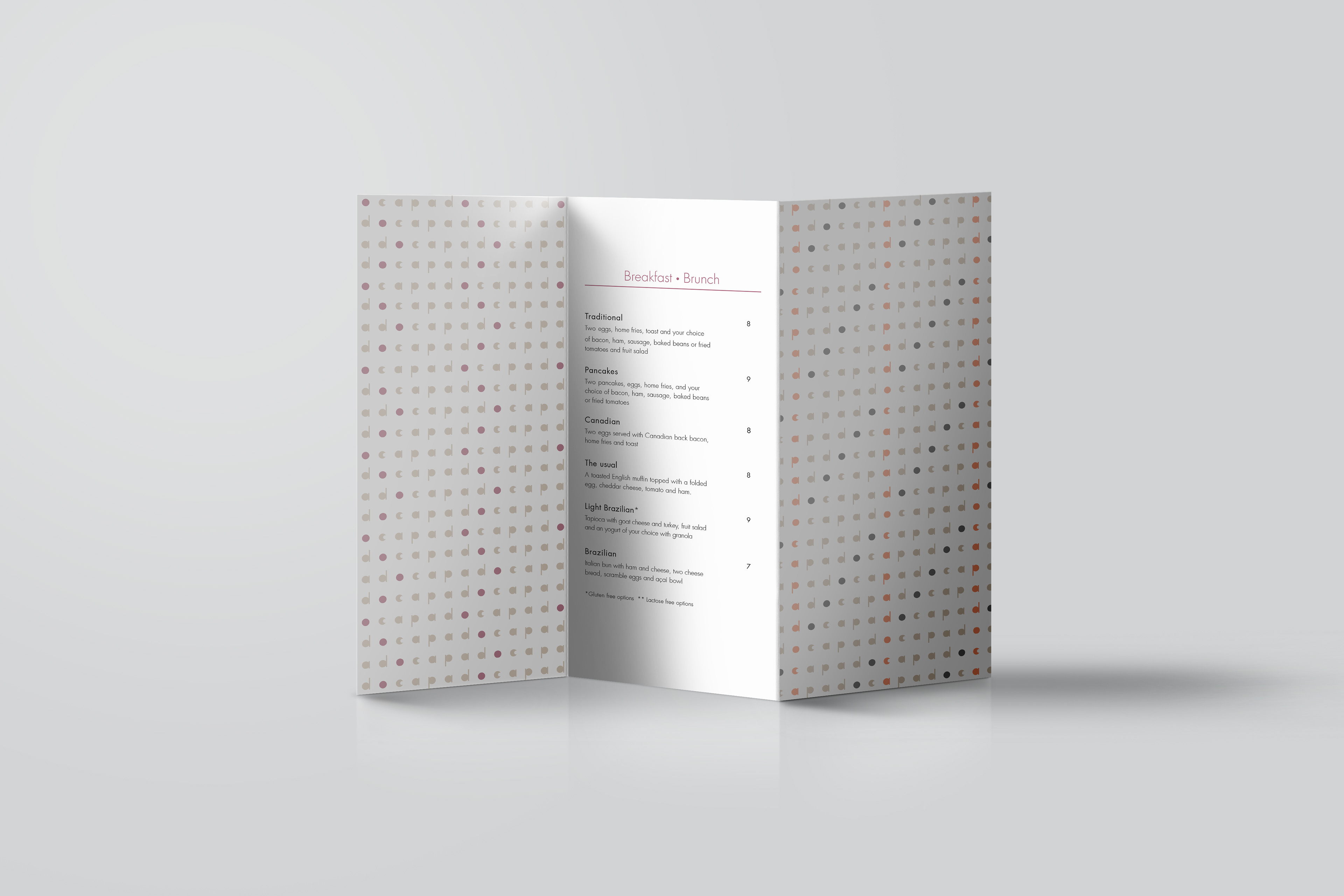
Tri Fold Menu
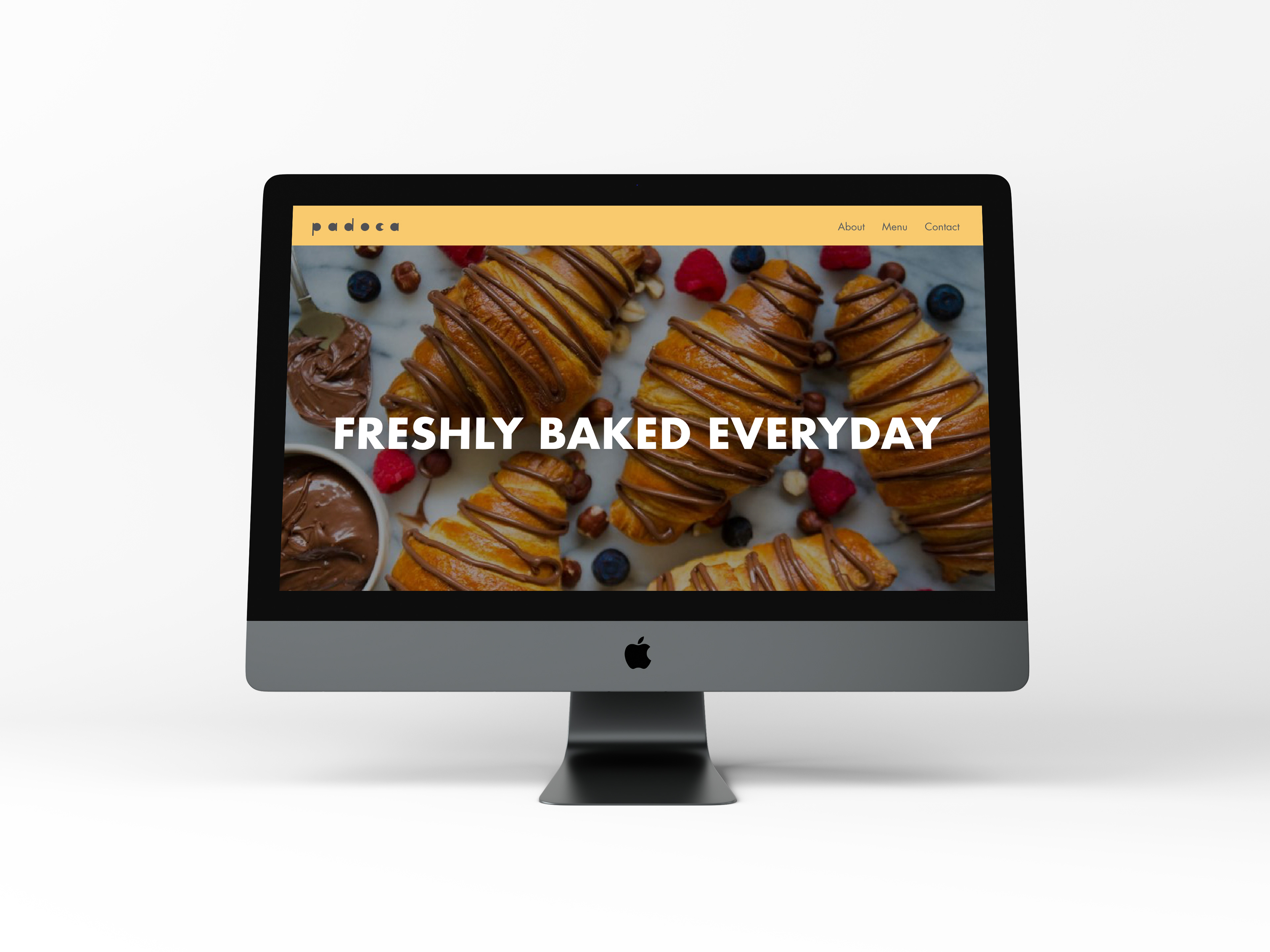
Padoca's Website
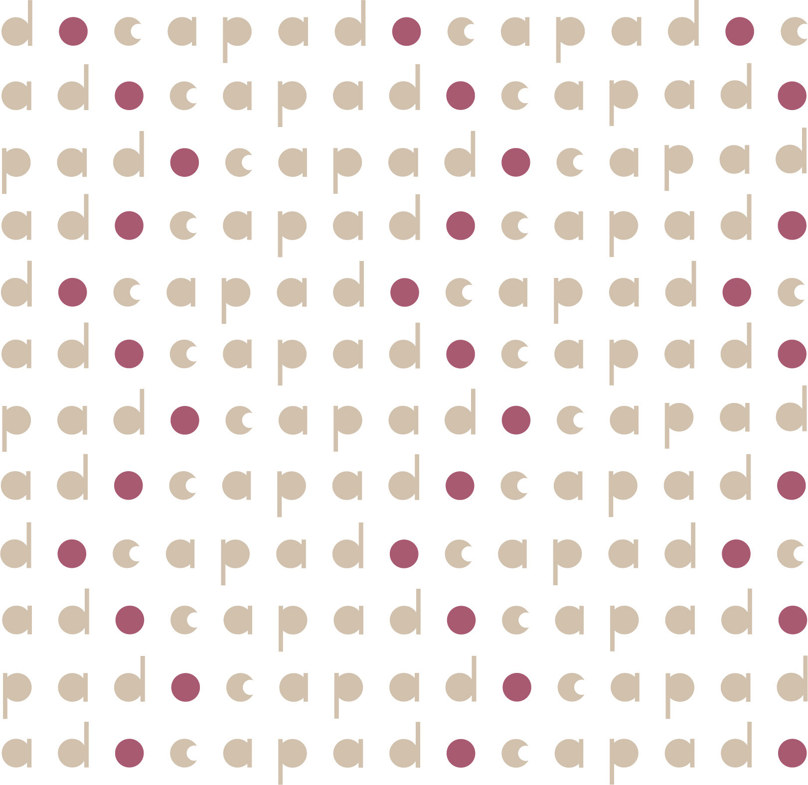
Padoca was created to share the culinary and baking goods of Brazilian bakery. The name is a short name for “padaria”, which means bakery in Portuguese. The target audience is any person who are familiarized with the Brazilian bakery and/or enjoys pastries, breads and baking goods. The key challenge in this project was to design a brand that represented Brazilian culinary without diverging from Canadian design and style. Additionally, the visual identity needed to be youthful and sophisticated, in order to embrace all ages and to be versatile throughout all digital and print platforms. Some solutions to overcome these challenges were: to create a new typeface that could represent both the rounded shapes of Brazilian and Canadian bakery; to use a sans serif font for a youthful but also elegant logo; and to create secondary logos to accommodate digital and printing materials, such as menus and packages.
Padoca's Website